-min.jpg)

.jpg)
Make the dull and empty corners of your home more bright and beautiful with these amazing home decor ideas.
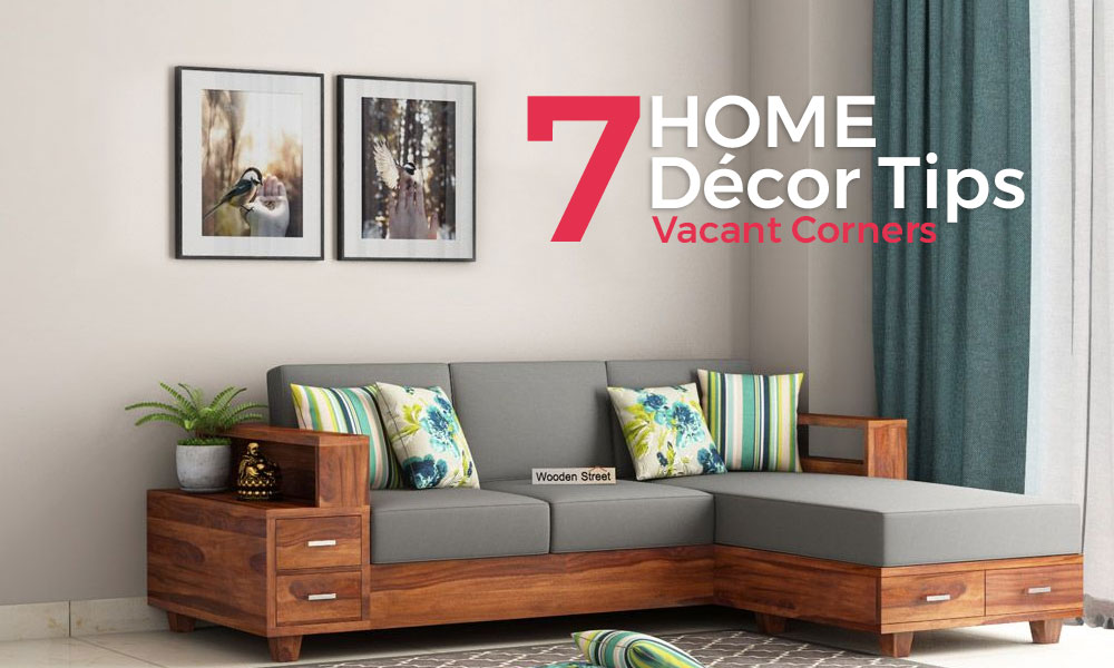
Empty corners are one thing nobody desires. They will stick out and make any lovely rooms look awkward and disproportionate. No room is complete and polished until all its alcoves are perfectly balanced and filled out. Fortunately, corner designing in general is simple and has the ability to brighten up your entire room. Now and then every necessity of a room is either a barstool, an extravagant wall, or an indoor plant. Each bare corner of a room is a space-production opportunity to exhibit your inner interior designer. You can utilize it for making a seating area by the window or a substitute home office watching out whilst enjoying the view.
Here are some of the simplest corner enhancement ideas to fill those awkward empty corners.
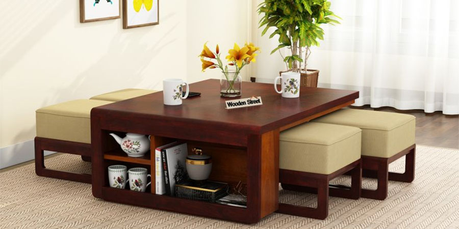
Ø Imagine a room beautifully decorated and lit but an awkward empty floor space ruin it all. To avoid such lopsided situations, deck-up the area with a lavish rug/carpet and highlight it by placing a coffee table. Place some indoor plants and mementos on it. If you want a tall look to it, opt for a higher round table and accessorize it with photo frames/indoor plants.
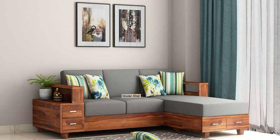
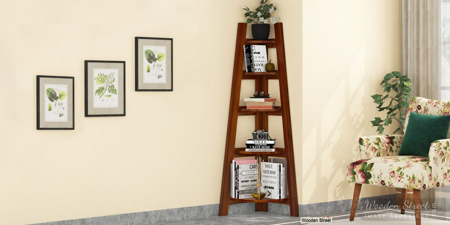
Ø Large living rooms end up having a lot of vacant spaces. Place corner sofas if the place permits, this will provide extra seating space as well as color to the room. Another alternative could be bookshelves, big wall clocks, and wall shelves. Moving your seating arrangements into the edges of the lounge area is also a decent method to eliminate empty corners and provide ample moving space around.
Ø If your empty corners are near French windows, balconies, or any place with enough natural lighting, fill it up with indoor plants. Keep the height varying or it will end up looking like a nursery. With different dimensions of greenery, it will give a natural and organic touch to your room without having to go for heavy furniture.
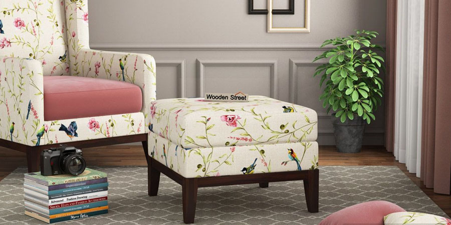
Ø Windows end up being the most common area for vacant spaces. Place your ottomans here along with a few other lower arrangement tables and seating. Finish the area up with wall lights, bright cushions, and a big throw pillow for comfort. This will remind you of your good old times at the cottage vacations.
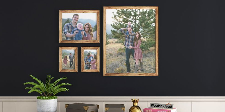
Ø At times, when you focus on filling up the floor spaces, wall corners end up being neglected. It's enticing to situate all your pictures, wall frames, and artwork in the center of the wall which leaves the corners blank. Bringing them into the corners brings a lot of attention not just because they are pretty, but also because it is not the spot you generally hope to discover them.
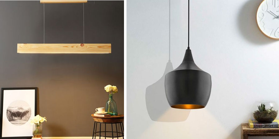
Ø If you have a high ceiling house, you might be disappointed by the dull corners that look worse because of the big footprint they get with them. Placing wall hanging lights, that fall down towards the floor does the trick. Placing high-end coffee tables or wall shelves fills up the entire corner leaving no area as it is.
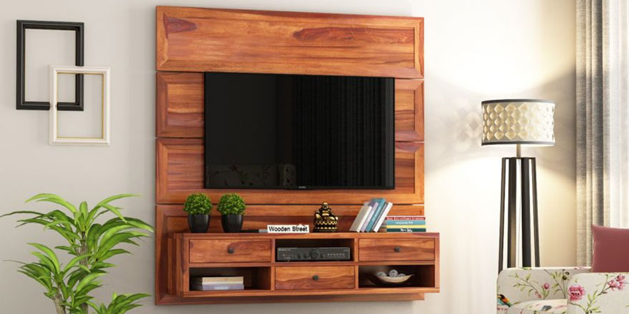
Ø Wondering what to do with the unfilled area below a wall-mounted television? Place a console table. It not just caters to the setup box and wires but also acts as a fixed place to find your remote. No more treasure hunts now. You can also go for a TV unit that offers a variety of space along with filling up that void.
Don’t ever be afraid of trying new things for your interiors. Always experiment with colors and remember to keep a height difference contrast in your room, i.e. if you have a tall plant, avoid elongated photo frames right next to it or the area will end up looking crowded. Instead, put small round ones to keep the area balanced. The main components of interior designing are space, line, structures, light, shading, surface, and pattern. Keeping them proportionate is the way to making a room look rich. Hope you enjoyed the read.
We will be back with our next blog soon, until then, Stay Tuned & Stay Trendy.
Articles you will love to read